| |
ROSEMARIE CASTORO, DAVID GORDON, ROBERT HUOT, JUDITH NELSON, PAUL NELSON, MARIANNE SCHARN, RYO TAKAHASHI
6 décembre 2007 - 2 février 2008
(merci de dérouler pour voir la traduction française plus bas)
ROSEMARIE CASTORO
ARCHED WIND, Welded stainless steel , 2005, 15‚ÄĚx10‚ÄĚx3‚ÄĚ
‚ÄúArched Wind‚ÄĚ which has a resonance to the 1969 ‚Äúcracking‚ÄĚ.
ROSEMARIE CASTORO (Oct. 30, 2007)
‚ÄúArched Wind‚ÄĚ is signed R.Castoro 2005 on the bottom. The best view would be determined by the height at which you choose to install it. The front and back is interchangeable. I am concerned with its portability.
ROSEMARIE CASTORO (Nov. 3, 2007)
ROSEMARIE CASTORO
Set of three :
I. 1969, ‚ÄúHow to make an atoll out of Manhattan Island‚ÄĚ, Edition 2/9, Offset lithography, 28x21.5 cm
II. 2007, ‚ÄúPhoto Cracking‚ÄĚ of 1969 ‚ÄúHow to make an Atoll out of Manhattan Island‚ÄĚ, Aluminum tape, HP archived inkjet print, Edition 2/5, 28x19 cm
III. 2007, ‚ÄúHow to make an atoll out of Manhattan Island Revisited October 28, 2007‚ÄĚ, HP archived inkjet print, Edition 2/5, 28x19 cm
Photographed 13th Street between 5th and 6th Avenue on Oct. 29, 2007 and discovered a crack in the sidewalk where I ‚Äúcracked‚ÄĚ in 1969. The buildings looked different, many of which had complete face lifts, or razed to re-build. We recognize in the outside world that which our work directs.
ROSEMARIE CASTORO (Nov. 3, 2007)
Following is a draft of ‚ÄúCracking‚ÄĚ history. :
The first inspiration was to divide my living area from my studio with an aluminum tape line, as a drawing delineating a function. 1969, ‚ÄúStreetworks‚ÄĚ viewed on my webpage in WRITINGS,
http://www.rosemariecastoro.com/1969%20April%2018%20Streetworks%20Cracking%20RCC.jpg
is making an atoll of Manhattan Island using the linear metaphor of aluminum tape chasing around a city block, notably 13th -14th streets, 2nd - 3rd avenues. 1969, thence to Paula Cooper Gallery, at 100 Prince Street, NY, to metaphorically take a big bite out of an outside corner of the gallery floor by running an aluminum tape line within the gallery, through the two rooms, up the walls and over the ceiling (viewed partially on my website in SCULPTURE, ‚ÄúGallery Cracking‚ÄĚ, Paula Cooper Gallery : http://www.rosemariecastoro.com/scul11.jpg).
1970, Lucy Lippard invited me to be in a show in Seattle ‚Äú555,087‚ÄĚ, where I cracked the inside museum space with aluminum tape, playfully encouraging the San Andreas Fault to meander into Washington state to cleanly break off the edge of the west coast of America as I was rather surprised anyone would want to live in a zone destined for such a possible disaster. Just helping mother nature. Spoke to a geologist there who was rather horrified at my insinuations.
Excerpt from ¬© Artforum, June 1975, ‚ÄúWorking Out‚ÄĚ by Lucy Lippard :
‚Äú(‚Ķ) In April she ‚Äúcracked‚ÄĚ a block of the sidewalk on 13th Street with a meandering line of thin silver tape ; in May she used the same medium to splinter the rooms of the Paula Coper Gallery, and in September, she made a gigantic cracking at the Seattle World‚Äôs Fair Center. It visually evoked a seismic disturbance quite out of proportion to the material expended. These curious kinetic remains were accompanied by a similar activity ‚ÄĒ the ‚Äúmoving‚ÄĚ of ceilings, or parts of them, by marking out a rectangle overhead with four wheeled ‚Äúcasters‚ÄĚ (the pun was intended). The element of humorous hostility in these inconspicuous but startling objects was later resurrected in the 1973 suspended sculpture ‚ÄĒ Burial‚ÄĒ which, more organic than geometric, reflected the change in her focus ; Its roots ‚Äúgrowing down from the ceiling‚ÄĚ. (‚Ķ)‚ÄĚ
ROSEMARIE CASTORO (Oct. 12, 2007)
DAVID GORDON
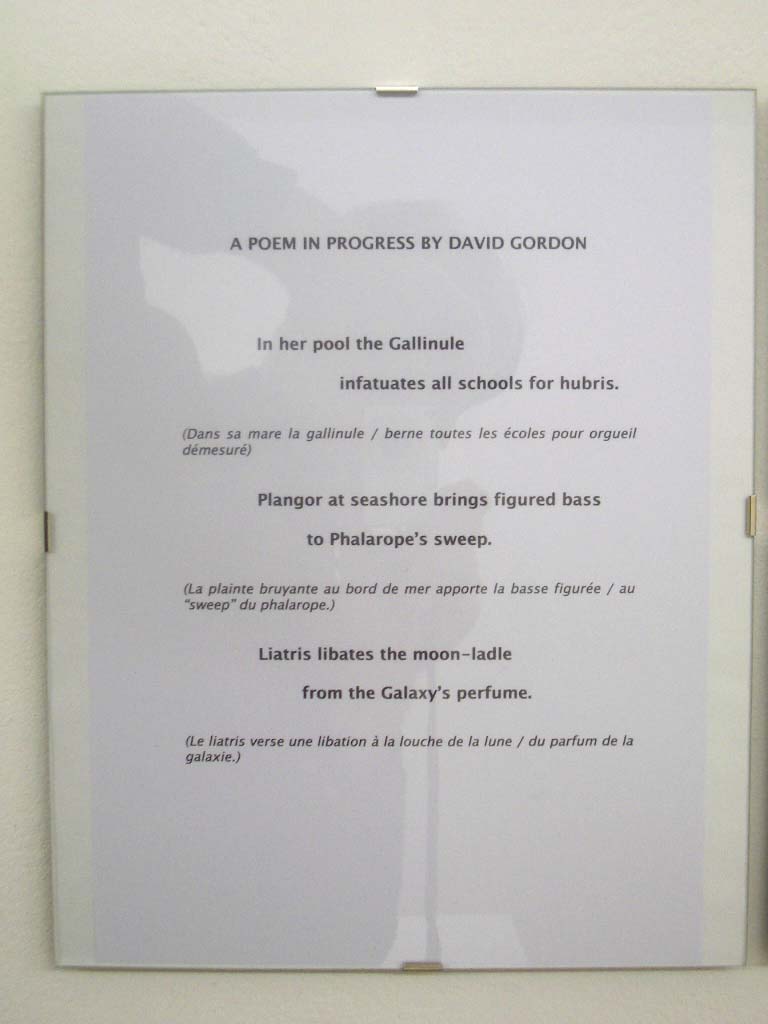
POEM IN PROGRESS, 2007, 3 pages
I am attempting in my work to continue traditions from Chaucer to Brancusi.
DAVID GORDON (Dec. 9, 2007)
ROBERT HUOT
VAT ORANGE, acrylic on canvas, 2007, 2 √©l√©ments, 24‚ÄĚx53‚ÄĚ
CAD YELLOW MED, acrylic on canvas, 2007, 2 √©l√©ments, 20‚ÄĚx44‚ÄĚ
Yes, I think they relate to ‚ÄúBikini for Kinne‚ÄĚ, but as you suggest, they are something else. When I returned from Paris, I wanted to work a little differently. I began to apply paint in a ‚Äústippled‚ÄĚ manner, to give the surface that you feel is cinematographic. ‚ÄúCAD YELLOW MED‚ÄĚ is correct (as in cadmium yellow medium.) Yes, ‚Äústipple‚ÄĚ may not be the ‚Äúright‚ÄĚ word. When we use stencils, we apply the paint or ink by using the brush in a piston like motion, vertically, up and down. This is what I mean by ‚Äústipple.‚ÄĚ Not ‚Äúpointillism‚ÄĚ.
ROBERT HUOT (Nov. 28, 2007)
I used "pinking shears." They cut the canvas with a saw-toothed "bite."
This cut prevents the fabric from unraveling.
ROBERT HUOT (Dec. 18, 2007)
JUDITH NELSON
LITHIC KEEN, 2006, Handmade paper, Red Dirt pod prints, Norfolk pine seeds, pods, 16‚ÄĚx20‚ÄĚx3‚ÄĚ
I make pieces that are shaped through layering printed, handmade paper, with island detritus. LITHIC KEEN evolved from restrictions of this process,fading and flaking with fissured seams.
JUDITH NELSON (Dec. 12, 2007)
PAUL NELSON
PASSAGE, 2007, Poem 1 page
PASSAGE
I seldom write formal poetry, like this sonnet, but there are times when it seems right to remind myself, if not readers, that all poems have form in the use of rhythm, metaphor, imagery that in-form the unstated meaning. At least they should ‚Ķespecially in a time when so much abstract language finds itself into the art, as if younger poets lack experience beyond their inner selves and must, therefore, directly express states of mind. In one of my graduate level workshops, a young poet said to me, ‚ÄúYou know, I have never touched an animal.‚ÄĚ I wondered about internalization through the computor, cell-phone, i-pod, tinted windows, air conditioning and the psychic energy used in fending off the environment and other people‚Äôs physicality and stories. I write assuming that ‚Äúthe natural object is always the adequate symbol,‚ÄĚ that the image implies the idea, that the music is transportive, that the fun of writing is linguistic as much as self-expressive. So this little sonnet is serious play with language and the traditional uses of writing poetry, including tone and audial and visual words, exaggerated. What art is not exaggeration? Could we imagine an art, including minimalism, that is not pushing the edge of perception and experience? So here is such a poem, to be read in good humor. This statement, perhaps, makes my point about poetry's strength in being abstract, hence longer and emptier than the sonnet by far.
PAUL NELSON (Dec. 3, 2007)
MARIANNE SCHARN
2007, acrylic on linen, 1O 5/8‚ÄĚx10 5/8‚ÄĚ
2007, acrylic on linen, 1O 5/8‚ÄĚx10 5/8‚ÄĚ
The new works come in pairs & continue to be of the horizon series. The vertical controlled brushstrokes with two colors form a horizon and are confined by the square surface.
MARIANNE SCHARN (Dec. 3, 2007)
RYO TAKAHASHI
BORNE, 2007, concrete and soot, 19 1/3 ‚ÄĚx15 3/4‚ÄĚ
SEUIL, 2007, pl√Ętre et oxyde de fer, 19 2/3 ‚ÄĚx15 3/4 ‚ÄĚ
The plaster piece is close to the exhibition ¬ę Threshold ¬Ľ, the concrete piece is close to the works ¬ę Bounds ¬Ľ ; but both of them are at the same time simpler than the previous ones.
3 points on the concrete : it is like the shadow that falls on the face. I touch certain places many times, with a brush that contains stains of water, or shadowslike. 3 places shows gradually as if they arose from the concrete’s bottom. The surface of this plate is smoothed as a glass pane.
Plaster : it is like woundings on the white surface. I pour the plaster in a frame box and work on the plaster still tender. 3 lines, these are marks to lead my hand, staight on. Iron powder, as well, teaches me the level of thickness I have to scrape off. When the face becomes flat, it is time to stop my movement.
It had to be thought of some very light works, but along the days, I used materials for housebuilding. They brought me on their way.
RYO TAKAHASHI (Nov. 12, 2007)
ROSEMARIE CASTORO
ARCHED WIND, acier inoxydable soudé , 2005, 37 x 26 x 8,5 cm
¬ę Arched Wind ¬Ľ qui a une r√©sonance avec le ¬ę cracking ¬Ľ de 1969.
ROSEMARIE CASTORO (30 octobre 2007)
¬ę Arched Wind ¬Ľ est sign√©e R. Castoro en bas. La meilleure vue serait d√©termin√©e par la hauteur √† laquelle tu choisis de l‚Äôinstaller. Le devant et le derri√®re sont interchangeables. Je suis concern√©e par sa portabilit√©.
ROSEMARIE CASTORO (3 novembre 2007)
ROSEMARIE CASTORO
Ensemble de trois :
I. 1969, ‚ÄúHow to make an atoll out of Manhattan Island‚ÄĚ, √Čdition 2/9, lithographie offset, 28 x 21.5 cm
II. 2007, ‚ÄúPhoto Cracking‚ÄĚ of 1969 ‚ÄúHow to make an Atoll out of Manhattan Island‚ÄĚ
ruban adh√©sif aluminium, impression √† jet d‚Äôencre d‚Äôarchive HP, √Čdition 2/5, 28 x 19 cm
III. 2007, ‚ÄúHow to make an atoll out of Manhattan Island Revisited October 28, 2007‚ÄĚ, impression √† jet d‚Äôencre d‚Äôarchive HP, √Čdition 2/5, 28 x 19 cm
Ai photographi√© la 13e rue entre la 5 et 6e Avenue le 29 octobre 2007 et ai d√©couvert un craquement sur le trottoir o√Ļ j‚Äôavais ¬ę craqu√© ¬Ľ en 1969. Les immeubles semblaient diff√©rents, beaucoup ont eu des ravalements complets, ou ont √©t√© ras√©s pour √™tre reconstruits. Nous reconnaissons dans le monde ext√©rieur ce qui dirige notre travail.
ROSEMARIE CASTORO (3 novembre 2007)
Suit un brouillon de l‚Äôhistoire du ¬ę cracking ¬Ľ. :
La première inspiration était de diviser mon aire de vie de celle de mon atelier avec une ligne de ruban adhésif aluminium, comme un dessin traçant une fonction.
1969, ¬ę Streetworks ¬Ľ que l‚Äôon peut voir sur mon site web √† WRITINGS, http://www.rosemariecastoro.com/1969%20April%2018%20Streetworks%20Cracking%20RCC.jpg
fait un atoll de l‚Äô√éle de Manhattan en utilisant la m√©taphore lin√©aire du ruban adh√©sif aluminium se lan√ßant √† la poursuite d‚Äôun p√Ęt√© d‚Äôimmeubles, notamment les 13e ‚Äď 14e rues, 2e ‚Äď 3e avenues. ¬Ľ
1969, de l√† √† la galerie Paula Cooper, au 100 Prince Street, New York, pour m√©taphoriquement mordre √† pleine bouche dans un coin ext√©rieur de l‚Äô√©tage de la galerie en faisant courir un ruban adh√©sif aluminium dans la galerie, √† travers les deux salles, sur le mur et le plafond (vue partiellement sur mon site web √† SCULPTURE, ‚ÄúGallery Cracking‚ÄĚ, Paula Cooper Gallery :
http://www.rosemariecastoro.com/scul11.jpg.)
1970, Lucy Lippard m‚Äôa invit√© √† √™tre dans une exposition √† Seattle ¬ę 555,087 ¬Ľ, o√Ļ j‚Äôai craqu√© l‚Äôespace int√©rieur du mus√©e avec du ruban adh√©sif aluminium, encourageant par jeu la faille San Andreas √† serpenter dans l‚Äô√©tat de Washington pour casser d‚Äôune fa√ßon nette le bord de la c√īte ouest d‚ÄôAm√©rique parce que j‚Äô√©tais plut√īt surprise que tout le monde veuille vivre dans une zone destin√©e √† un tel d√©sastre possible, seulement aider m√®re nature. Ai parl√©-l√† √† un g√©ologue qui a √©t√© assez horrifi√© par mes insinuations.
Extrait de ¬© Artforum, juin 1975, ‚ÄúWorking Out‚ÄĚ de Lucy Lippard : ¬ę (‚Ķ) en avril elle a ¬ę craqu√© ¬Ľ un p√Ęt√© de trottoir sur la 13e rue avec une ligne sinueuse de mince ruban adh√©sif argent ; en mai elle a utilis√© le m√™me m√©dium pour faire une brisure dans les salles de la Galerie Paula Cooper, et en septembre, elle a r√©alis√© un gigantesque cracking dans le Seattle World‚Äôs Fair Center. Il √©voquait visuellement une perturbation sismique, tout √† fait hors de proportion avec le mat√©riau employ√©. Ces curieux restes cin√©tiques √©taient accompagn√©s d‚Äôune activit√© similaire ‚ÄĒ le ¬ę d√©placement ¬Ľ de plafonds, ou de parties d‚Äôeux, en d√©limitant un rectangle au-dessus de la t√™te avec quatre ¬ę casters ¬Ľ [¬ę roulettes de fauteuil ou de meuble ¬Ľ ; ¬ę castors ¬Ľ] (le jeu de mot √©tait voulu).
Les √©l√©ments d‚Äôhostilit√© humoristique dans ces objets discrets mais saisissants ont √©t√© ressuscit√©s dans la sculpture suspendue de 1973 ‚ÄĒ Burial ‚ÄĒ qui, plus organique que g√©om√©trique, refl√©tait le changement dans son centre de vis√©e ; ses racines ¬ę poussant vers le bas √† partir du plafond ¬Ľ. (‚Ķ) ¬Ľ
ROSEMARIE CASTORO (12 octobre 2007)
DAVID GORDON
POEM IN PROGRESS, 2007, 3 pages
Je tente de continuer dans mon travail des traditions de Chaucer à Brancusi.
DAVID GORDON (9 décembre 2007)
ROBERT HUOT
VAT ORANGE, acrylique sur toile, 2007, 2 éléments, 60 x 134 cm
CAD YELLOW MED, acrylique sur toile, 2007, 2 éléments, 50 x 113 cm
Oui, je pense qu‚Äôelles sont reli√©es √† ¬ę Bikini for Kinne¬Ľ, mais comme tu le sugg√®res, elles sont quelque chose d‚Äôautre. Quand je suis revenu de Paris, je voulais travailler un peu diff√©remment. J‚Äôai commenc√© √† appliquer la peinture d‚Äôune fa√ßon ¬ę faite en pointill√© ¬Ľ, pour donner la surface que tu vois comme cin√©matographique. ¬ę CAD YELLOW MED ¬Ľ est correct (comme dans cadmium yellow medium).
Oui, ¬ę stipple ¬Ľ peut ne pas √™tre le mot ¬ę exact ¬Ľ. Quand nous utilisons des pochoirs, nous appliquons la peinture ou l‚Äôencre en se servant du pinceau comme d‚Äôun piston, verticalement, de haut en bas. C‚Äôest ce que je veux dire par ¬ę stipple ¬Ľ. Pas du ¬ę pointillisme ¬Ľ.
ROBERT HUOT (28 novembre 2007)
J'ai utilisé des "ciseaux à cranter". Ils découpent la toile avec une "attaque" en dents de scie.
Cette découpe pour empêcher le tissus de s'effilocher.
ROBER HUOT (18 décembre 2007)
JUDITH NELSON
LITHIC KEEN, 2006, papier fait-main, emprunte de cosses de Red Dirt, épines de pin Norfolk, cosses, 42 x 52,5 x 7,5 cm
Je fait des pi√®ces qui se forment par superposition de couches de papier fait-main imprim√©, avec des d√©tritus d‚Äô√ģle, d‚Äôarbres et de plantes. LITHIC KEEN a √©volu√© des restrictions de ce processus, se d√©fra√ģchissant et s‚Äôeffritant avec des coutures fissur√©es.
JUDITH NELSON (12 décembre 2007)
PAUL NESLON
PASSAGE, 2007, Poème, 1 page
PASSAGE
J‚Äô√©cris rarement de la po√©sie formelle, comme ce sonnet, mais parfois il semble juste de me rappeler √† moi, si ce n‚Äôest aux lecteurs, que tous les po√®mes ont une forme dans l‚Äôusage du rythme, de la m√©taphore, de l‚Äôimagerie qui in-forme le sens non exprim√©. Au moins ils devraient‚Ķ sp√©cialement √† un moment o√Ļ une telle quantit√© de langage abstrait se trouve dans l‚Äôart, comme si les po√®tes manquaient de l‚Äôexp√©rience au-del√† de leur moi int√©rieur et devaient, pour cette raison, exprimer directement des √©tats d‚Äôesprit. Dans un de mes ateliers d‚Äô√©criture de dipl√īm√©s, un jeune po√®te m‚Äôa dit, ¬ę vous savez, je n‚Äôai jamais touch√© un animal. ¬Ľ Je me suis interrog√© au sujet de l‚Äôint√©riorisation √† travers l‚Äôordinateur, le t√©l√©phone portable, l‚Äôi-pod, les fen√™tres teint√©es, l‚Äôair conditionn√© et l‚Äô√©nergie psychique utilis√©e √† mettre une barri√®re √† l‚Äôenvironnement et aux autres gens en tant qu‚Äô√™tres physiques et avec des histoires. J‚Äô√©cris en supposant que l‚Äôobjet naturel est toujours le symbole ad√©quat, que l‚Äôimage implique l‚Äôid√©e, que la musique tend √† transporter, que le plaisir d‚Äô√©crire est linguistique autant qu‚Äôexpression de soi. Donc ce petit sonnet est un jeu s√©rieux avec le langage et les utilisations traditionnelles de l‚Äô√©criture de po√©sie, y compris le ton et les mots audios et visuels, exag√©r√©s. Quel art n‚Äôest pas de l‚Äôexag√©ration ? Pourrions-nous imaginer de l‚Äôart, y compris le minimalisme, qui ne pousse pas les bords de la perception et de l‚Äôexp√©rience ? Donc voici un tel po√®me, √† lire en bonne humeur. Ce que je d√©clare-l√†, peut-√™tre, est ma position sur la force de la po√©sie √† √™tre abstraite, d‚Äôo√Ļ bien plus longue et bien plus vide que le sonnet.
PAUL NELSON (3 décembre 2007)
MARIANNE SCHARN
2007, acrylique sur toile de lin, 27 x 27 cm
2007, acrylique sur toile de lin, 27 x 27 cm
Les nouveaux travaux viennent en paires et continuent √† √™tre des s√©ries d‚Äôhorizons. Les coups de pinceaux verticaux contr√īl√©s avec deux couleurs forment un horizon et sont cantonn√©s par la surface carr√©e.
MARIANNE SCHARN (3 décembre 2007)
RYO TAKAHASHI
BORNE, 2007, béton et suie, 49 x 40 cm
SEUIL, 2007, pl√Ętre et oxyde de fer, 50 x 40 cm
La pi√®ce en pl√Ętre est proche de l'exposition ¬ę Seuil ¬Ľ, la pi√®ce en b√©ton est proche des oeuvres ¬ę Bornes ¬Ľ ; mais toutes les deux sont en m√™me temps plus simples que celles d'autrefois.
3 points sur le béton : c'est comme l'ombre qui tombe sur la face. Je touche certains endroits bien des fois, avec un pinceau qui contient comme des taches d'eau, ou bien comme de l'ombre. 3 endroits se montrent peu à peu comme s'ils surgissaient du fond du béton. La surface de cette dalle est lisse comme la vitre.
Pl√Ętre : c'est comme des blessures sur la surface blanche. Je verse le pl√Ętre dans un cadre et j'interviens sur le pl√Ętre encore tendre. 3 lignes, ce sont des marques pour conduire ma main, tout droit. La poudre de fer, aussi, m'enseigne le niveau d'√©paisseur que je dois gratter. Quand la face devient plate, c'est le moment d'arr√™ter mon geste.
Il a fallu penser à quelques oeuvres très légères, mais au courant des jours, j'ai utilisé des matériaux pour les travaux de la maison. Ils m'ont amené sur leur chemin.
RYO TAKAHASHI (12 novembre 2007)
© 2007, ROSEMARIE CASTORO, DAVID GORDON, ROBERT HUOT, JUDITH NELSON, PAUL NELSON, MARIANNE SCHARN, RO TAKAHASHI
TRADUCTION ARNAUD LEFEBVRE
All Rights Reserved
Tous Droits Réservés.
|
Exhibit Images
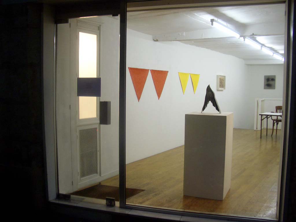
Vue d'ensemble
© Galerie Arnaud Lefebvre, 2007
ROSEMARIE CASTORO (1)
ARCHED WIND, 2005, Welded stainless steel, 15”x10”x3” (37 x 26 x 8,5 cm)
© Rosemarie Castoro, 2007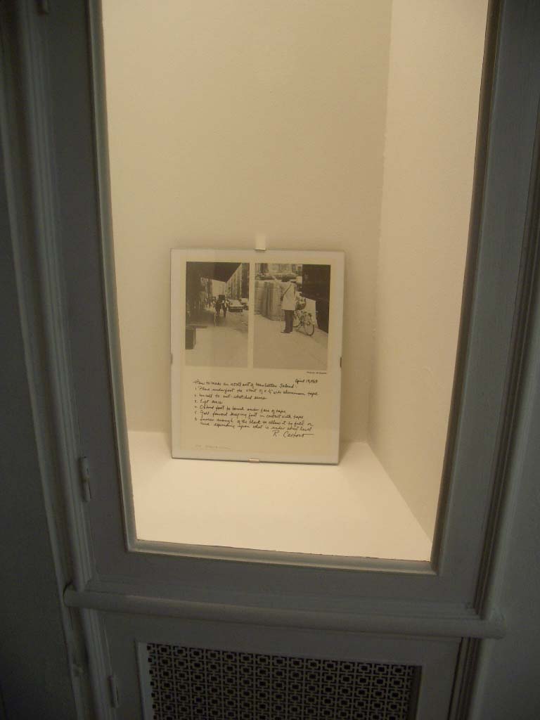
ROSEMARIE CASTORO (2)
Set of 3 :
I. 1969, “How to make an atoll out of Manhattan Island”, Edition 2/9, Offset lithography, 28 x 21.5 cm
“How to make an atoll out of Manhattan Island:
1. Place underfoot the start of a 1/4" wide aluminium tape.
2. Unroll to outstretched arms
3. Lift knee
4. Extend foot to touch outerface of tape
5. Fall forward keeping foot in contact with tape
6. Loosen enough of the block to allow it to fall or rise depending upon what is under street level.”
(traduction: “Comment faire un atoll de l'Ile de Manhattan: 1. Placer sous le pied le d√©but d'un ruban adh√©sif aluminium de 0,65 cm de large. 2. D√©rouler jusqu'√† extension des bras 3. Lever le genou 4. √Čtendre le pied pour toucher la face ext√©rieure du ruban 5. Tomber en avant en gardant le pied en contact avec le ruban 6. Rel√Ęcher suffisamment du rouleau pour lui permettre de baisser ou de monter selon ce qui se trouve au niveau de la rue.”)
© Rosemarie Castoro, 2007
ROSEMARIE CASTORO (3)
II. 2007 , “Photo Cracking” of 1969, “How to make an Atoll out of Manhattan Island”, aluminum tape, HP archived inkjet print, Edition 2/5, 28 x 19 cm
III. 2007, “How to make an atoll out of Manhattan Island Revisited October 28, 2007”, HP archived inkjet print, Edition 2/5, 28 x 19 cm
© Rosemarie Castoro, 2007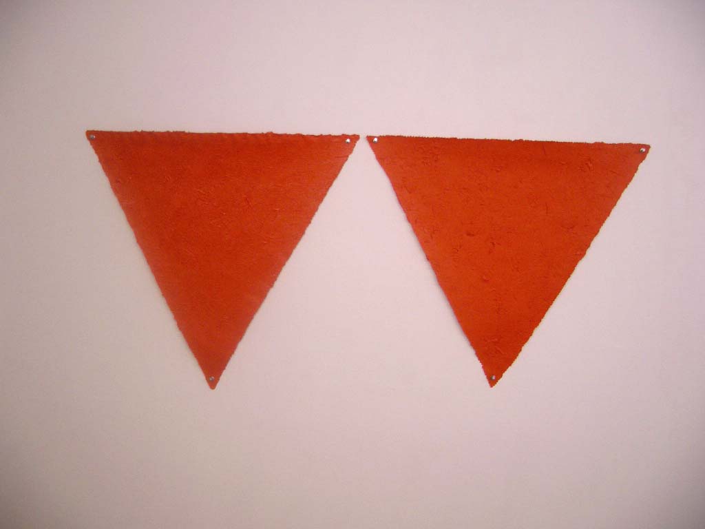
ROBERT HUOT (1)
"VAT ORANGE", acrylique sur toile, 2007, 2 éléments, 60 x 134 cm
© Robert Huot, 2007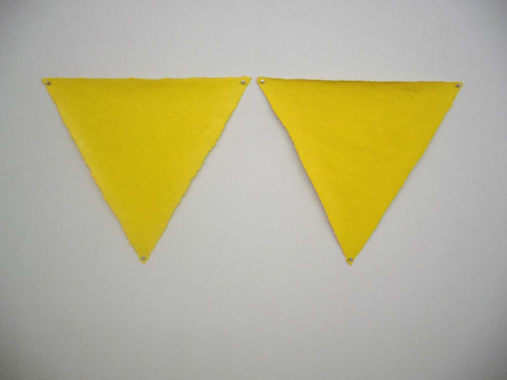
ROBERT HUOT (2)
"CAD YELLOW MED", acrylique sur toile, 2007, 2 éléments, 50 x 113 cm
© Robert Huot, 2007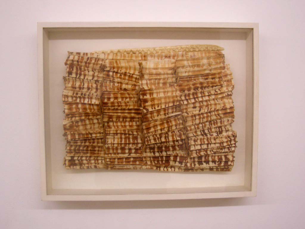
JUDITH NELSON
"LITHIC KEEN", 2006, Handmade paper, Red Dirt pod prints, Norfolk pine seeds, pods, 16”x20”x3” (42 x 52,5 x 7,5 cm)
© Judith Nelson, 2007
RYO TAKAHASHI (1)
"BORNE", 2007, béton et suie, 49 x 50 cm
© Ryo Takahashi, 2007
RYO TAKAHASHI (2)
"SEUIL", 2007, pl√Ętre et oxyde de fer, 50 x 40 cm
© Ryo Takahashi, 2007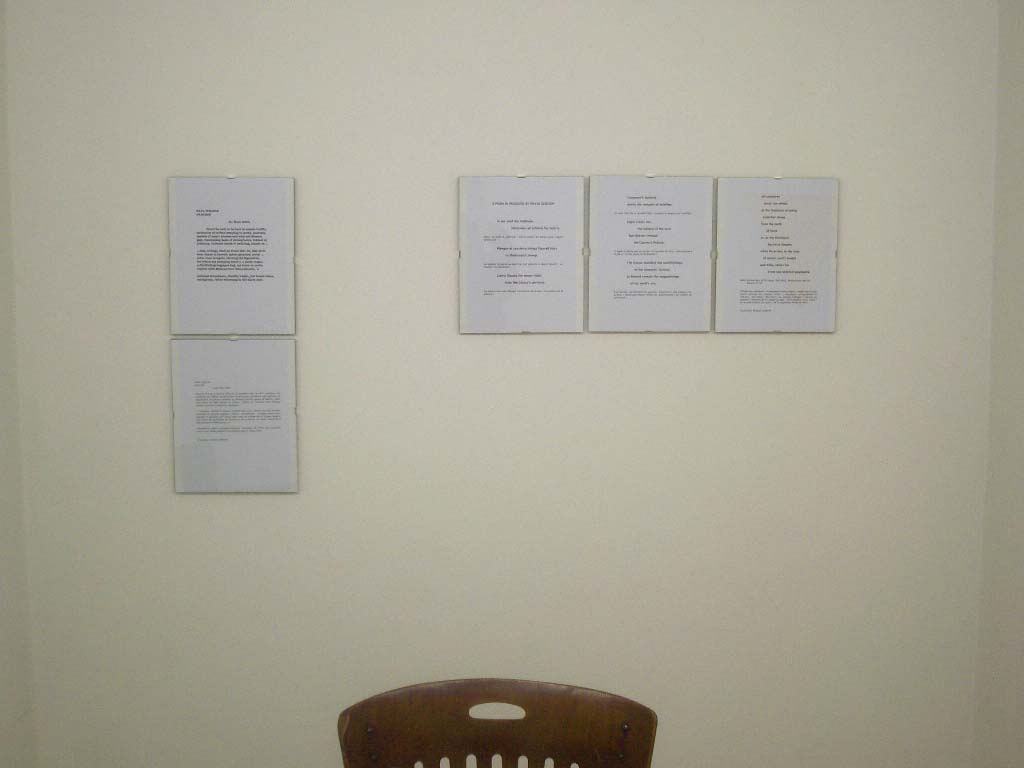
Paul Nelson, David Gordon
© Galerie Arnaud Lefebvre, 2007
PAUL NELSON
"PASSAGE", 2007, Poem, 1 page
© Paul Nelson, 2007
PASSAGE
-pour Reno Odlin
Pourrait √™tre de la chance d’√™tre de la poussi√®re dans le trafic cosmique, des mol√©cules de carbone se balan√ßant en duos, des quartettes, des septuors de respirations bruyantes comiques et pourquoi pas de gigues de Mozart, salles r√©sonantes de poils tendus en cordes, frott√©s de courants d’air r√©sineux ineptes, de nous tournoyants, clastiques...
... morceaux, cordes, la plupart si petits que tous, comme des airs lyriques, accordés en galaxies spirales à barres, chantonnent... tarogato sotto voce, remuant le figuratif, pour lequel mon coeur qui pompe est un organe maboul, une poche de cornemuse en fibrillation, mon cerveau en mode, rempli de la discontinuité de Mohorovicic, un
transducteur s√©duit, platement tragique, seulement de l’√©ther bien accord√©e, petits riens, ficelle respirant bruyamment dans la caisse noire.
(traduction Arnaud Lefebvre)
DAVID GORDON
"POEM IN PROGRESS", 2007, 3 pages
© David Gordon, 2007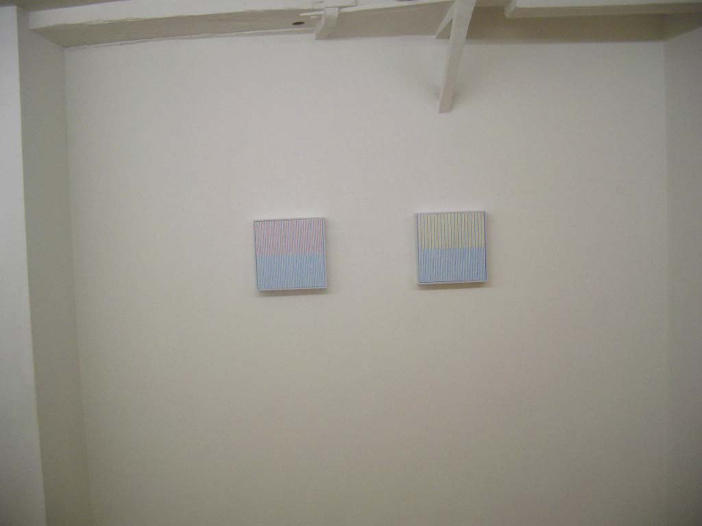
MARIANNE SCHARN
© Galerie Arnaud Lefebvre, 2007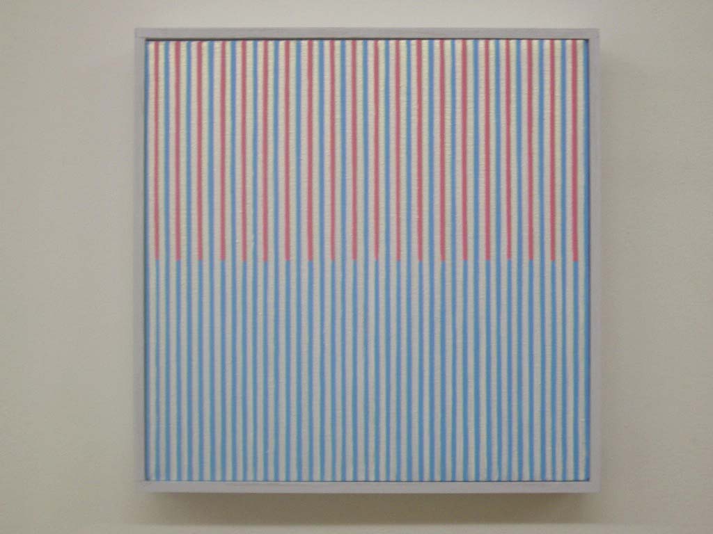
MARIANNE SCHARN (1)
2007, acrylic on linen, 27 x 27 cm
© Marianne Scharn, 2007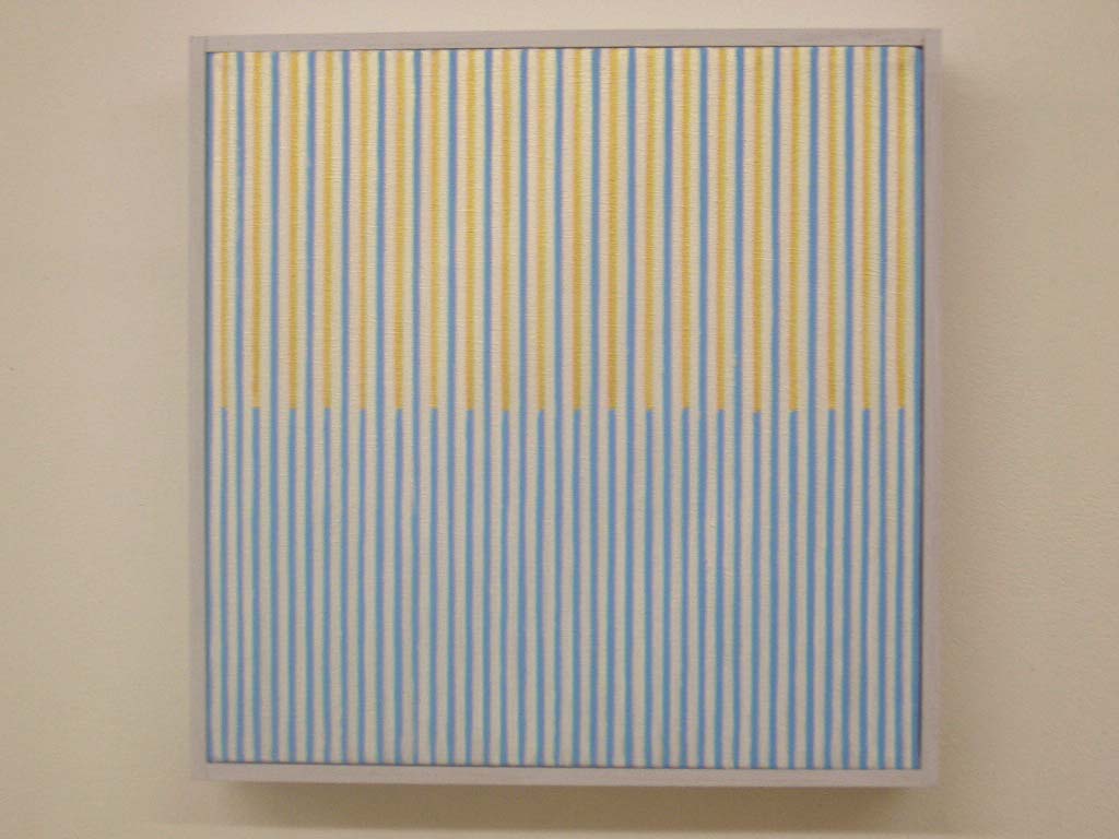
MARIANNE SCHARN (2)
2007, acrylic on linen, 27 x 27 cm
© Marianne Scharn, 2007 |
